Branding


retail insite
commercial real estate, california
Retail Insite is a commercial real estate company in Southern California. The objective was to create a refreshed brand voice and vision.


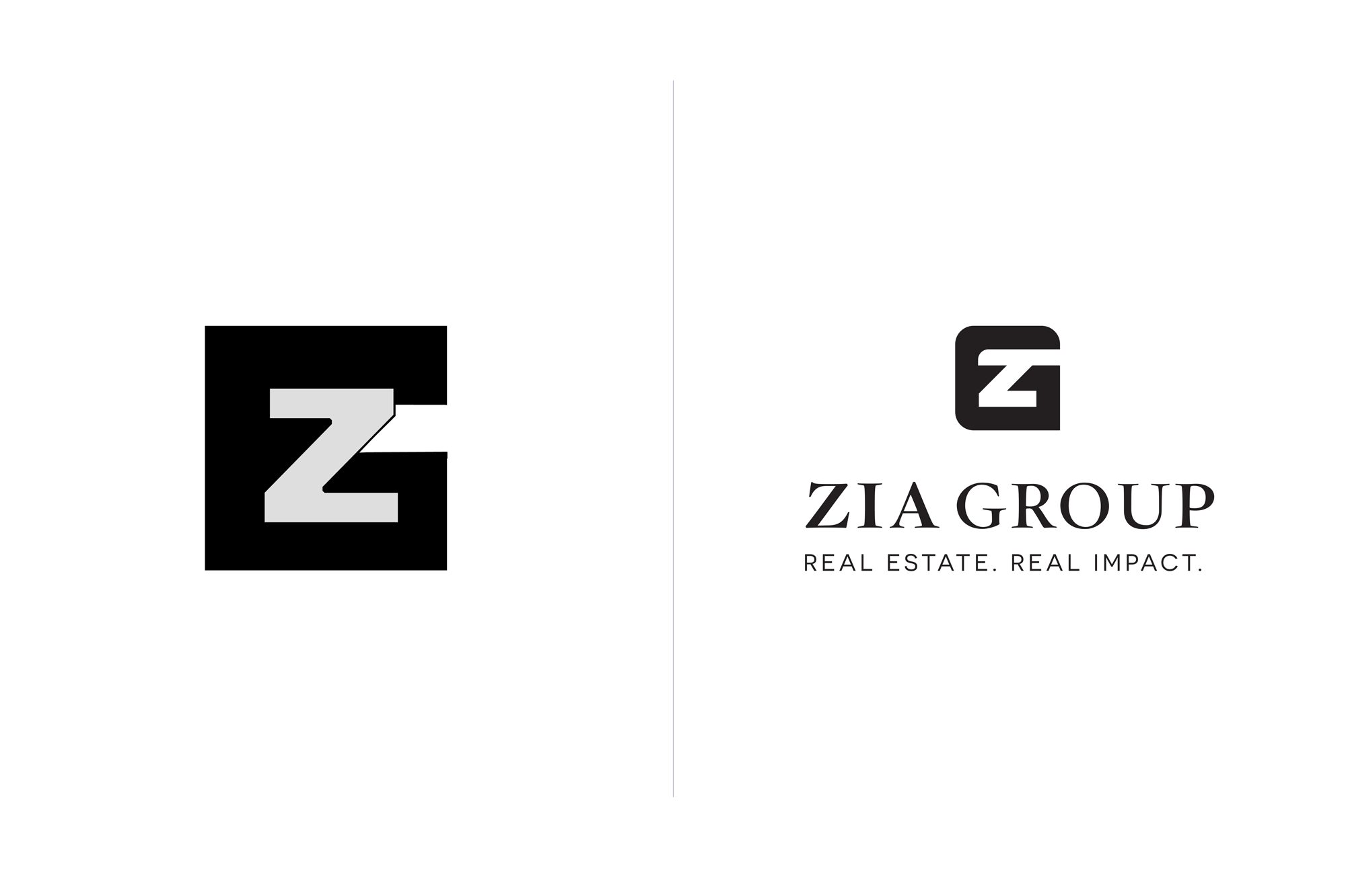
zia group
real estate, california
Zia Group is a real estate company in Santa Barbara, California. The logo required a but of finesse and refinement in addition to a new type system.
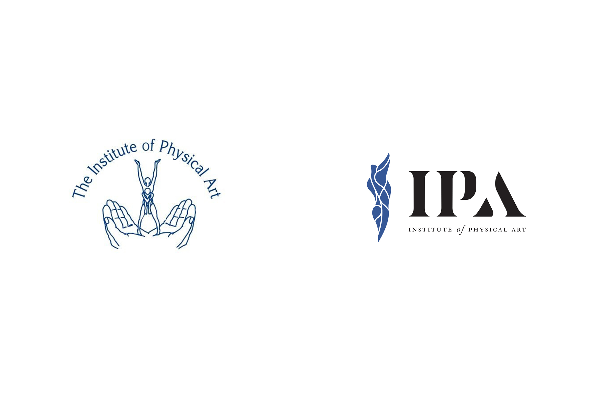
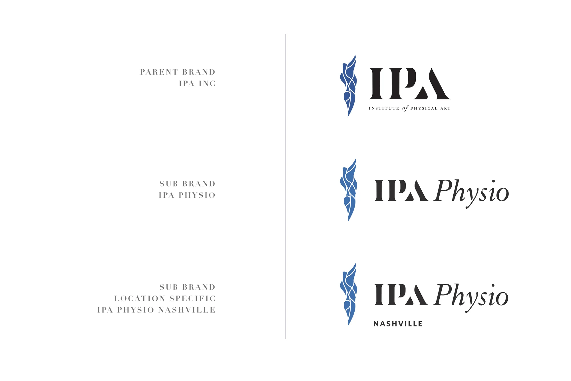
institute of physical art
Physical therapy, usa, india, japan, poland,
The Institute of Physical Art (IPA) was founded in 1978 in an effort to promote the use of manual therapy and education to facilitate optimum human function. Therapists are trained in the IPA paradigm and have a presence both in the United States and Internationally. The IPA has a foundation, an educational arm, products, two clinics, a fellowship offering, and offer training and testing for the CFMT (Certified Functional Manual Therapist).
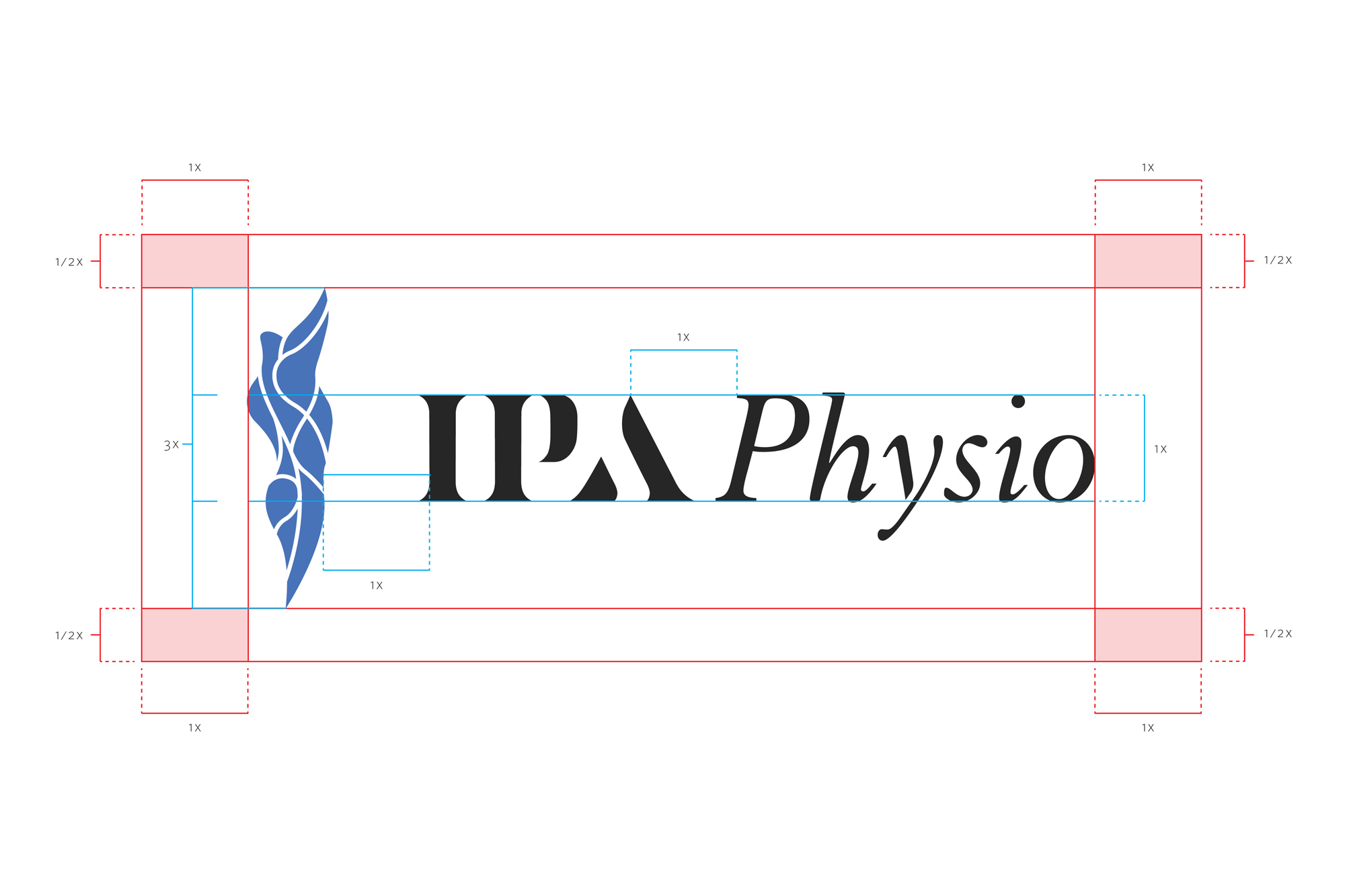
The objective was to create a modern, sophisticated system that reflected the future of physical therapy. The body mark was inspired by IPA's PNF (Proprioceptive Neuromuscular Facilitation) patterns—the body's most efficient movement patterns and the wordmark was inspired by the 3 Pillars of IPA (mechanical, neuromuscular, and motor control) and were a visual representation of visual balance and forward momentum.
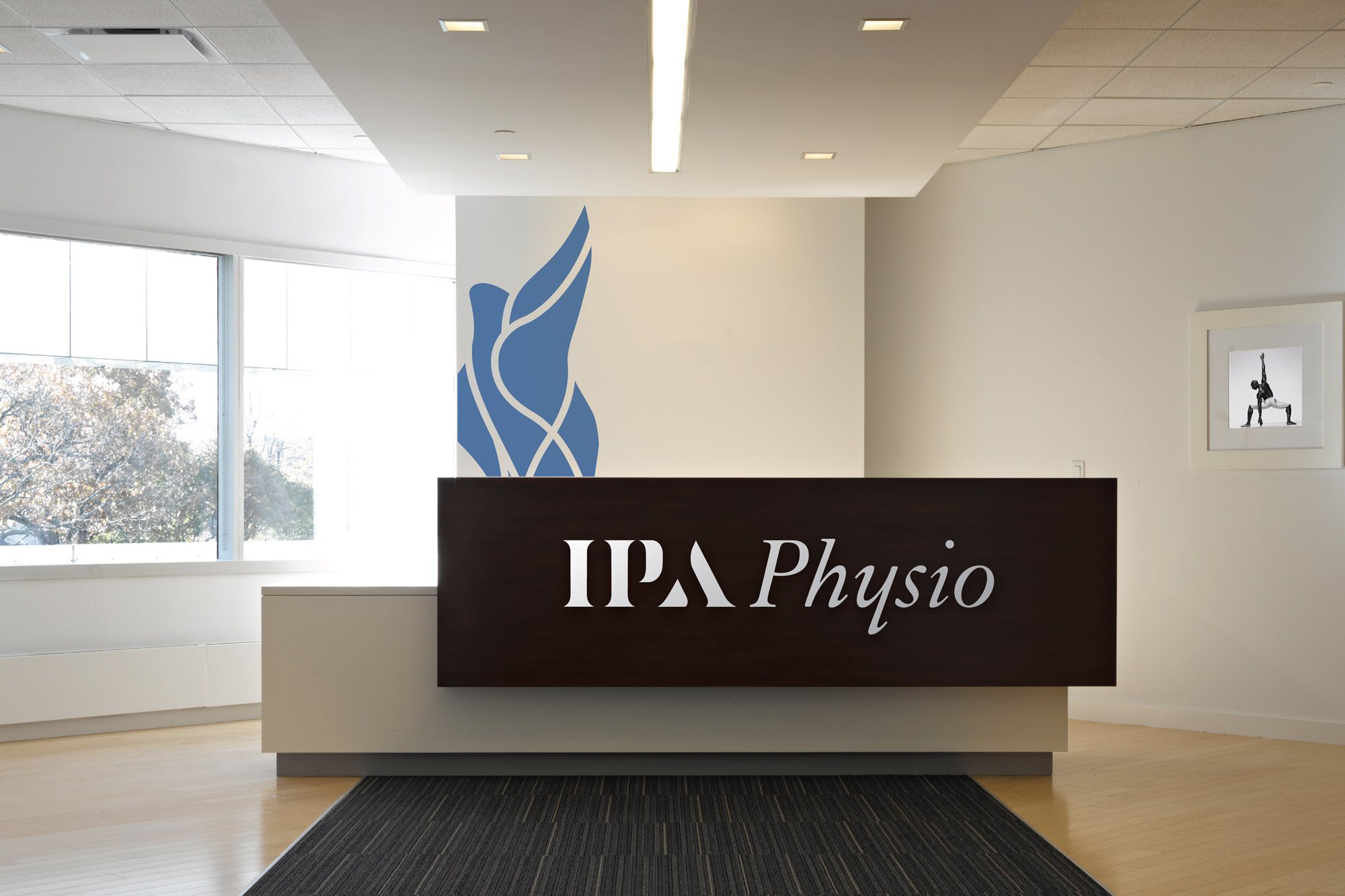
ipa physio
physical therapy, usa
The Institute of Physical Art (IPA) started a subsidiary company in an effort to start new clinics and physical therapy centers around the United States. With the same 3-Pillar approach as well as the goals of education and treatment, IPA Physio focuses on the client's wellness first and foremost. As a sub-brand of the Institute of Physical Art (IPA), it needed to be of the same brand DNA but a more youthful representation of the brand. With a revised color palette, introduction of illustrations and apparel, the brand came alive in its applications.


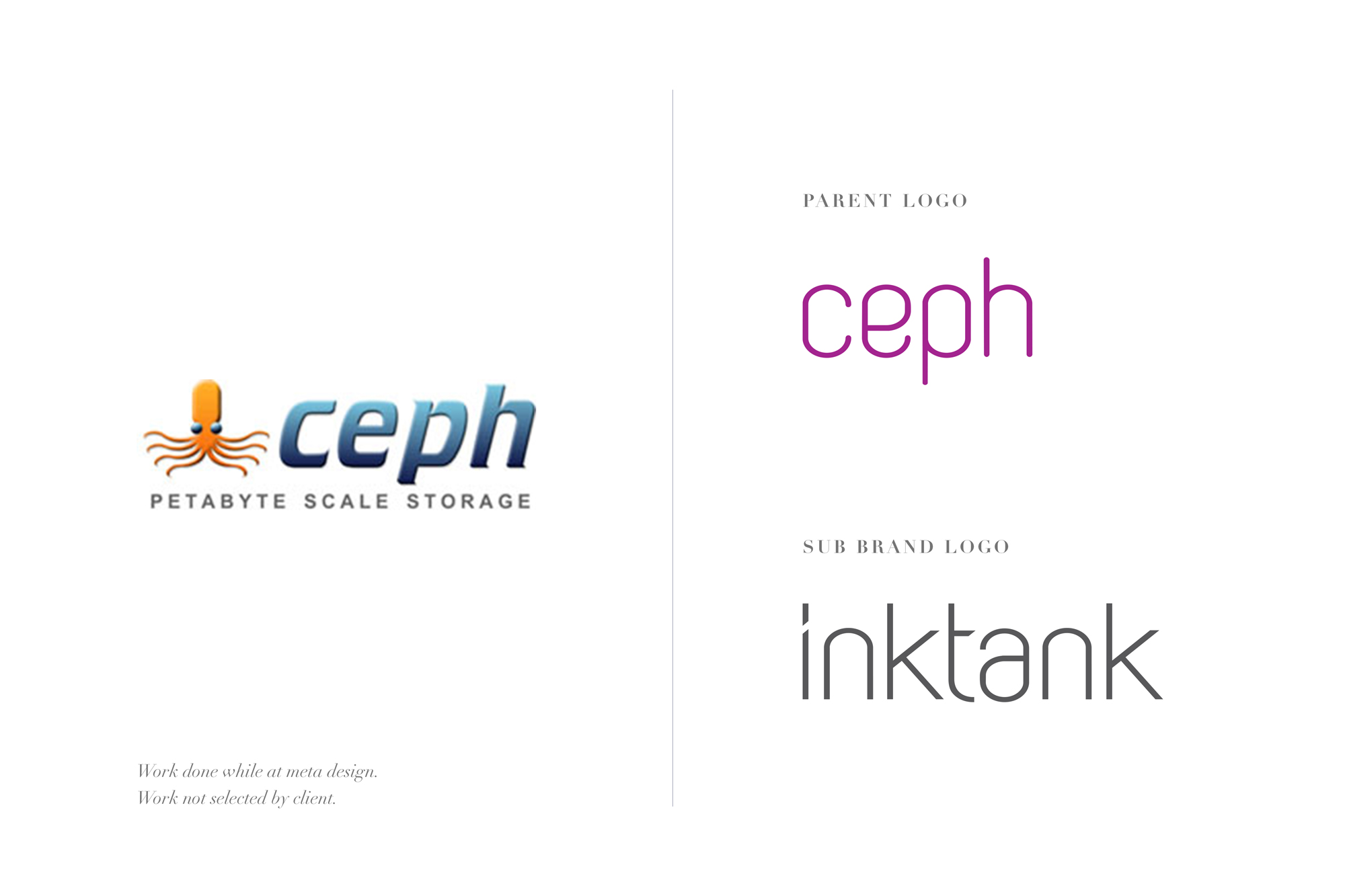
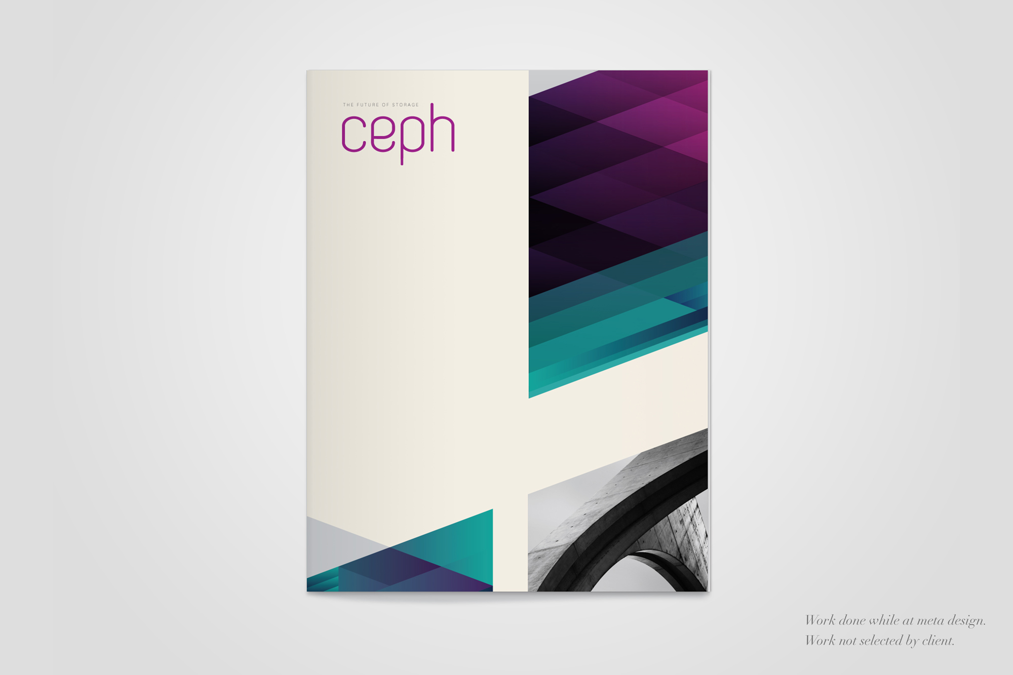
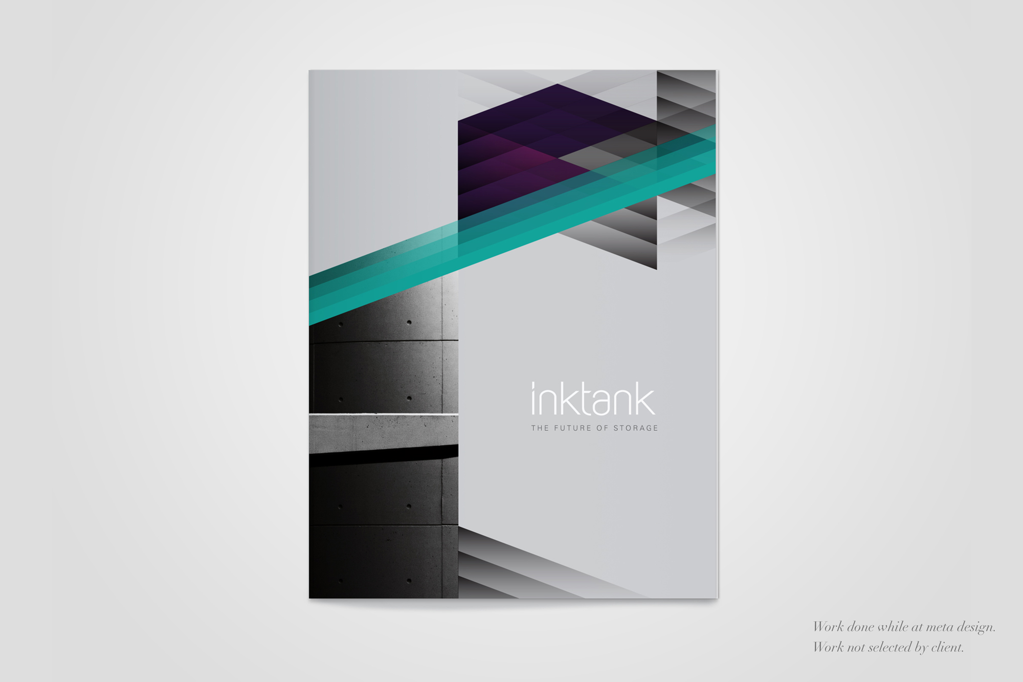
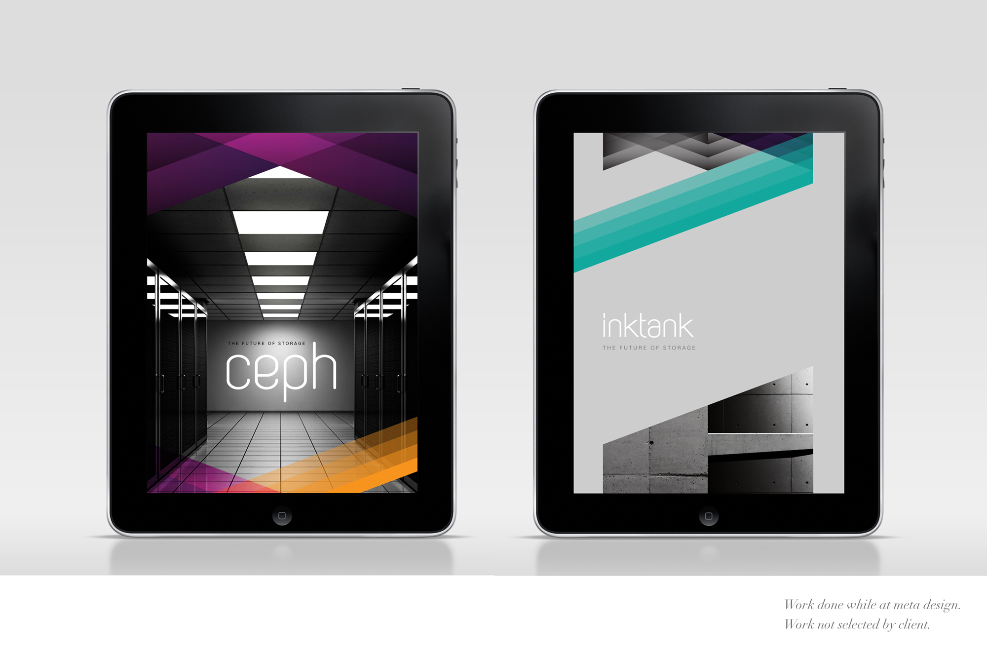
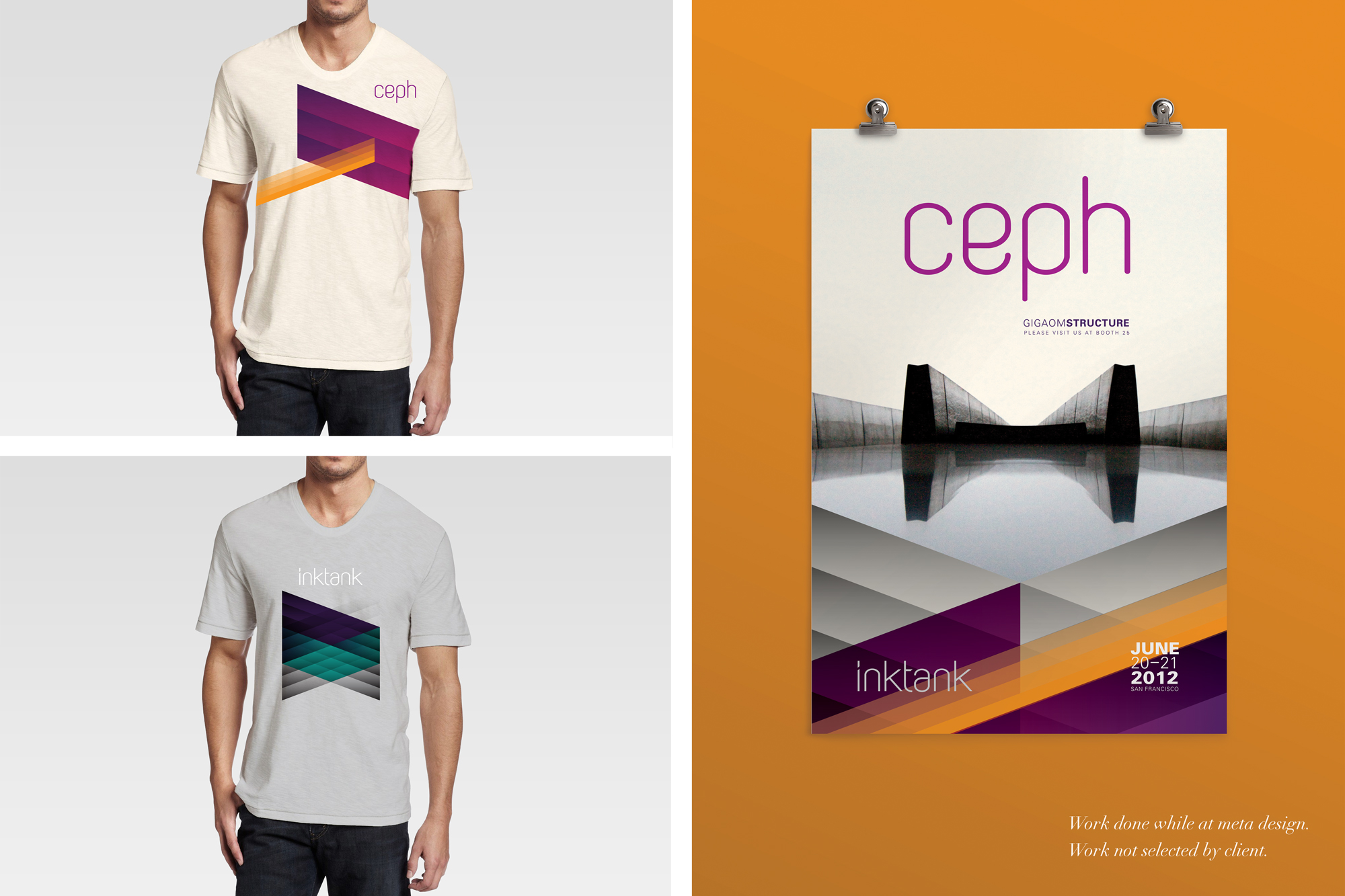
ceph & inktank
online storage
Ceph is an online storage parent company. The objective was to move away from the playful yet confused octopus identity into a new, fresh identity that maintains fluidity and a sophisticated concept of playful. I created a custom typeface for the brand as well as for it's subsidiary brand, Inktank, the consumer-facing brand.
Creative Diretor: Stan Zienka
Designer: Katie King Rumford
This work was completed while at MetaDesign San Francisco, it was not selected by the client.